![[Last]](../../bar/last.gif)
![[Up]](../../bar/parent.gif)
![[Next]](../../bar/next.gif)
![[RSS links]](../../images/rss16.png)
Gadget scrolling
Support had been added for the alternate pointing device (scroll-wheel) through the WindowScroll module. This would send messages to the application for icons which had flagged that they were interested in the scroll events. These messages could be trapped through the 'filter' interface for each gadget, much as any of the other events could be manually trapped. However, this is a bit wasteful - part of the point of having gadget handlers was that the common parts of the work are taken away from the gadget itself.
A new gadget entry point for 'Mouse Scroll' (MScroll) was added
to the gadget handlers to allow the gadget to handle these events
themselves. The slider gadget uses this so that when you scroll over its
region, the value being represented is changed. This makes a lot of sense
for things like volume controls and position indicators, and it makes the
feature available to all applications.
Other gadgets were updated to support generation of a new event,
Window_GadgetMouseScroll, which will be delivered if the user
scrolls over that gadget. This allows (for example) the Writable gadget to
be updated if the user scrolled over it - a feature that is used by the
Number Range gadget to cause any scrolling whilst over the Writable gadget
to update the value in it.
Number Range bounding
There were some problems with the way that the Number Range gadget performed its bounding on the input. Or rather, the way that it didn't. It was very inconsistent in its checking of the validity of the number that was entered. The user could enter a number outside the range of the gadget and this would be accepted - only when the adjuster arrows were used would the number be checked. At first, this was updated so that the value was checked after every character, but this was impossible to make work for some numbers. There was a little back and forth between (I think it was) Christopher Bazley and David Moore about the way that this worked.
The fun problem was that if you bounded the number every time you changed the field, it would be possible to construct ranges that you could never input some numbers into. A range of 5 to 11, for example would never be able to input 10 or 11 if it showed a number 5 to 9. If the number shown was '5' then you couldn't delete it to enter the '1' of '10' because an empty field has a value of 0, and that is less than 5, so it would be bounded to 5 again. That didn't work.
Instead, I came up with a set of rules based on the reasoning that certain operations confirmed the current value as the one that the user intended, and validated it. Moving the caret out of the window, pressing return, or the application reading the value were all confirmations of the value, and would cause it to be bounded. In the meantime, the user could enter any number they liked (within the acceptable bounds of base 10), and it would only be bounded once confirmed. This meant that the value read by the application would always be bounded and the same as the value on the screen, and the value on the screen would always be bounded unless the caret was currently in the icon.
Part of this became tricky - detecting when the caret leaves an icon needed some extra work, which the Window module performs on the Gadget's behalf. When the caret leaves the gadget, it is informed through a new event. That meant that the special casing should be able to be applied consistently to other gadgets.
Gadget fonts
The handling of fonts in icons had never been all that obvious within the Wimp. For regular templates you could assign a font to an icon, but if the font was not available when the template was loaded, the template would not load - which limited the functionality of them. Similarly, the style which the user has requested tends to be particular to them and going against that was discouraged in the Style Guide. Fortunately this was something that most application authors agreed on, and the number of applications which used different fonts was low.
This may also have been related to the fact that many applications didn't handle changing modes well. I certainly learnt my lesson on RISC OS 2 when trying to use different fonts - things would look a mess if you changed mode and applications did not obtain a new font handle. Another common problem was that the font handles claimed as part of the template were not released when the application was exited. When loading templates the count of the number of handles claimed was stored in an array. Worse, the array to which they were stored presumes that there are only 256 font uses within the template. The array is also byte addressed, so there are only 256 font handles available, but this is also the case in the icon definitions, which expect to be able to encode the font handle into a 8 bits within the icon flags (which is itself the colour of the icon, so the icon colours are relegated to the indirection data).
All in all, using fonts within windows - at least at the definition level - is not pretty. Within the Toolbox, things are a little better, but only a little. In theory, all the font handling is managed for you, but in reality those same things come back to bite you. At least until I fixed a load of them. Font handles leaking, or being randomly claimed on mode changes were possible, as well as leaks when gadgets were created manually, or when plotted within !ResEd. Pretty sure I didn't completely fix that latter problem, but it was a significantly improvement.
Many of the fixes to the font handling were incidental, coming about whilst related parts of the code were examined, and the breakages were found in the part which handled fonts. Or more commonly, 'which failed to handle fonts'. As with many of these sorts of changes, some were found by simple exercises of "if it does this here, then it needs to do that over there... oh... it doesn't".
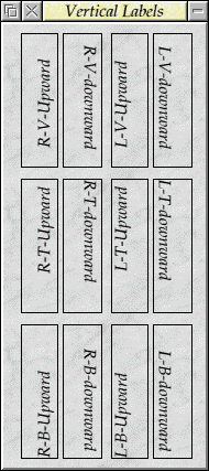
Some examples of alignments and orientations.
Some of the problems were found because of a change I made to the way in
which I had extended the label gadget. For some time I had wanted to be able
to label things vertically - usually to save space beside an image of
something, rather than labelling above it. Using a font matrix, together
with the Wimp font handle, and replacement fonts for when the system
font is in use, the text can be rotated pretty easily. The rotation only
applies to the label gadget, but that's the usual gadget type that can
use the rotation.
The most common place I think would be useful for using the rotated labels would be beside graphs and representations - for example, the ColourDbox (if it wasn't implemented independently) could label the vertical axis of its colour slices using such a label. Graphs, and sprite captures (eg camera views) might be labelled vertically to save space. Vertical slider bars could be labelled vertically, which makes a lot more sense than labelling at the top.
It might be a relatively rare thing to need, but I think it is pretty useful to have the ability in your arsenal - better to have choices than to be left saying "nope, can't do that". Plus it was fun to use the font matrix for something, especially in a font specifier where you'd not usually use it.
Gadget timers
The work on the databases had brought about a useful feature - that of a gadget being able to called back after a period, or through some trigger. The Scrolling List used this as part of its database updates, but it wasn't the right place to have such things. Most gadgets were, up till then, static and only changed due to some user input, or under application control. Gadgets which could run on their own without input from the user or application were not possible. Such gadgets are usually quite specialised, as they are showing something that is not part of the immediate interface, but there are a class of gadget which are affected by time which could benefit from such timers.
The gadget triggering mechanism was moved out of the Scrolling List and in to the Toolbox module itself. One of the original ways that I wanted to do the triggerable events was to manipulate the task's SWI Wimp_PollIdle timeout. However, this only supports the use of timed events. In many cases we would prefer to have events which can be triggered which do not rely on time. The database system offers a typical example - communication with a remote server might produce a result at any time, and polling for events in every task for every possible set of inputs they might have is not very efficient.
Instead, the events can be queued from anywhere and the application will
receive a notification when the system returns to the desktop. Usually,
though, gadgets would just set timers so that they are called back regularly.
This is all managed by an external task - the 'Waker' - which would poll
for pending Toolbox events with a pollword. When an event became available,
the pollword would be set, or the idle period would be triggered, and the
pending events would be dispatched to the tasks.
Although I've said that Gadgets would receive the events, that's
not quite the case. The Toolbox maintains a list of events to be triggered
per object. The Gadgets actually talk to the Window object to perform these
registrations, and when the timer events occur they are notified through a
new TimerOp entry point.
The actual code needed within the gadget to handle such timer operations was pretty small, which meant that it was easy to write gadgets which demonstrated the operations. I can't really remember which of the test gadgets I wrote first - whether it was the KITT gadget or the BounceBall gadget. I have a feeling it was the KITT as that is just made up of filled icons where their colour changes - which is simpler. Redraw handling didn't come till a little later.
Gadget visibility
Whilst working on the gadgets, another requirement was found - that of knowing when the window became visible. Particularly for the timers, but possibly of use elsewhere, it was useful to know that the window that the gadget was located in had been opened, or closed. This was useful for the timers because it meant that gadgets (particularly animated ones) could start their activity when the window was opened, rather than the timers running from their creation.
Similarly, gadgets needed to be aware that the windows had been closed, either intentionally through the activation of the Default action button, or through the application closing or deleting the window directly. A new gadget handler was added for this, so that each gadget had the ability to track the state of its window. Most gadgets would not care, so would not include the handler, so it was entirely backward compatible.
Gadget handler flags
Being able to directly trigger timers on gadgets was a very useful improvement in the functionality of the Toolbox, but it introduced a problem. Together with the redraw handling, this pushed the number of gadget handlers to 17. The gadget handlers are entry points for the gadget which the Window module calls. Each handler is entered with a reason number for the gadgets - redraw events were 16, and timer events were 17.
When gadgets register themselves with the Window module they provide a structure which describes the gadget:
- The Gadget's type (which includes the length of the gadget instance structure, so you can support later iterations of the structure).
- The acceptable flags for the gadget (to reject future versions of the gadget which are controlled by feature flags).
- Implementation handlers flags (which provide the a filter for the handlers).
The handler flags are a 2-bit field per handler, which allows the handler to say how the handler should be dealt with. The default state is 'No handler', which prevents the gadget being called for those events. Some events cannot usefully be 'No handler', like 'Add gadget' - if you cannot add the gadget then there's little point in it existing.
Most gadgets will have many of their handlers set to the 'Default handler' state. This state means that the Window module performs its default operations for the handler. Usually this is the same as 'No handler', but in some cases the Window module can do all the work. The 'move gadget' handler is typical of this - its default operation is to move all the icons associated with a gadget by the offset of one corner of the gadget. Gadgets which require special handling for resizes couldn't use the default handler, but most other gadgets can.
Finally there is the 'Private handler' state. This is the state where the gadget actually gets called to perform the operation.
Anyhow, as there are 2-bits allocated in the mask per handler, with 17 handlers we overflow a 32-bit word, and the initial version of the gadget registration is no longer sufficient. I introduced a second handlers word to the flags, which allowed up to 32 handlers to be registered, and marked this with a flags word. Internally, the Window module converts all the registrations to the new format, but with the unused handlers set to 'Default'.
Because the SWI Window_RegisterExternal call would reject any registrations that had an unknown flag set, this meant that earlier versions of the Window module would correctly recognise that they did not understand the new format of the registrations. The Timer handler was the last new event to be added, so there wasn't any need for more bits to be used.
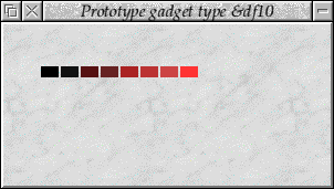
KITT
The KITT gadget was exactly what you might think - a sweeping red light as part of a gadget, just as the Knight Industries Two Thousand used to have in Knight Rider. The sweeping display is made up of 8 separate gadgets which used the RISC OS 4 true colour specification to change the filled background colour to make the correct colour.
Fading the gadget is simple - all the constituent gadgets are also faded (or un-faded). Because the KITT gadget is one of the first gadgets to use the timer events, it doesn't actually use the Gadget Timer entry point - it checks for the timer event manually through the filter operations, which makes the code more complex than it ought to be.
The animation looks a bit off - I think something happened in the capture, but it was smooth as it swept in both directions.
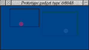
BounceBall gadget
In order to make it possible to have animated gadgets, there needed to be a way that you could redraw those gadgets regularly. Adding timers so that they could be updated regularly was one part of that. The other part was to have a way to redraw regions of the window. One solution would be to make all Window objects user redrawn, and handle their redraw there. That would cause a significant impact on all applications for every render operation, and was a little heavy handed - not unreasonable but too heavy for what was needed.
The RedrawManager module provided a perfect way to do this. As mentioned in the Desktop rambles, the RedrawManager was integrated into the build so that it could provide just this functionality for the Toolbox gadgets. The Gadget handlers were again updated to provide Redraw handler entry points. Whenever a Gadget was added which had a Redraw handler present, it would be automatically registered with the RedrawManager so that, when the redraw was necessary, the Window module would be called and pass the call on to the relevant Gadget.
The gadget just has to redraw the region - the graphics rectangle has already been set up to reflect the region being redrawn, and the bounds of the icon are supplied. It's not unlike the redraw that you would perform when doing a user redrawn window normally.

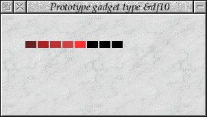
BounceBall gadget, the right hand one is a faded gadget.
(Animated version (24K))
Adding the two functions together is relatively easy, although it might
seem a little pointless as first if all you can draw is a bouncing ball.
The bouncing ball was intended as a simple demonstration - and test -
that the redraw handling worked properly and could be used reliably. There
are issues with the redraw of the regions in that there was some flicker
involved. This could have been fixed later by some better management of
the redraw handling.
The Bouncing Ball code just updates the position of the balls on a timer, moving them to their new logical position, and then issues a force redraw to cause the changed section of the window to be updated. When the redraw is needed, the Redraw handler for the Gadget is called (via RedrawManager and Window) and the redraw is performed for the ball in its current position.
Also the gadget would issue a 'beep' whenever a ball hit the edge of its gadget. Really irritating, but it showed that the timing was about right, and that the delay between the request for a redraw, and the redraw happening, wasn't high enough to be noticeable most of the time.
The redraw colours used by the gadget are set by the gadget and manipulated during redraw to apply the fade, if necessary. This became a part of the gadget library so that it was easy to fade any gadget's colours properly. The Bouncing Ball wasn't actually configurable in its colours - mainly because it was just an experiment and didn't really matter what it was, just that it animated.
Normally a gadget would create icons, or other gadgets (or nested windows), to provide a representation of the gadget in the window, but as the redraw was handled by the RedrawManager/handler entry point, there isn't actually any need for any of these. However, if the user is expected to interact with the gadget, it is necessary to have some way of detecting the interaction. Although that could be performed through filtering the mouse click on the background, that wouldn't be ideal as the gadget itself might be placed over other gadgets (notwithstanding the RedrawManager redraw being outside the icon ordering) and filtering for all clicks might be expensive.
The simplest way to handle such things is to create an icon which has no content - no border, no text, no fill, no sprite - which means that it gets click events but isn't visible. In the case of the Bouncing Ball, the icon it creates has a border - partly because you can see where you need to click, but mostly because it makes the bouncing more logical. Otherwise the ball's hitting invisible edges, which just looks odd.
As a test of how to use the timers and redraw together, it worked quite well - and was going to be an example gadget to supply to developers wanting to use the new features.
AnimatedIcon
Whilst the KITT gadget had been a simple set of icons to animate, and the bouncing ball had gone all out to show that it was possible to provide generic animations, there was a gulf between them. The gulf that was in reality the most common case. Usually, the animation indicates that some activity is happening - for things like browser activity and the like.
These would be simple to represent as a sequence of sprites which would be cycled through. Indeed, this was all that !Browse did for its animated logo; you could change it to something else and it would work quite nicely. Using this as a basic goal, I created the AnimatedIcon gadget. Really it isn't all that more complex than the KITT gadget, in that it just manipulates icons. Instead of updating the validation to indicate different colours, the sprite name in the validation string is changed to a new sequence every time the timer ticks.
Written before the existence of proper gadget timers, the gadget handled everything itself on its filters. Really it should have been updated (as should the other gadgets) to use the proper gadget timer entry point, but it was still classed as an experiment, and wouldn't be promoted to a part of the Toolbox gadget set until at least the next Select release.
The intention with the gadget was that it could be configured to use a given sprite area and sprite name prefix, and a set delay for the animation frames. The prefix would be used with digits appended, starting from 0 and incrementing on each tick. When the sprites were exhausted it would return to 0. I had planned to give the gadget flags to cycle back and forth, or to be single trigger - which would allow animated gadget to be 'set' to a given state.
Similarly, I thought it would be useful to add 'option' like capability, where it could animate from one state to another when clicked, and be read like an option icon - and a radio form of the same type. Adding in click actions would be a part of that, and aligning some of the actions with the ToolAction gadget would not be unreasonable. However, although these things were nice, they might not have appeared in the first versions that were seen, as it would depend on whether any component actually needed those facilities or not.
The animation was quite reasonable really, and worked on the animated spinner I had created for !Browse. I hadn't tried anything more complicated, though - the work was put on hold and it never got much further.
Hyperlink
The Hyperlink gadget was one of the simpler gadgets I created, and didn't require any new features of the Toolbox. It could present itself either as a label, or as a button, and when clicked it would trigger the loading of a web page or other resource through the associated URL. The intention was that this gadget could easily replace the code required for 'visit website' or similar in applications.
Unfortunately, the implementation of the Hyperlink is simple because attaching a URI request to a button is trivial. As such, it's pretty pointless having a gadget that provides the functionality when it can be implemented in code. The same argument can be used for the horizontal divider gadget that I introduced, but... well, I guess I didn't apply the same criteria at the time. So the Hyperlink module remained purely an experimental module and never went any further.
Disclaimer: By submitting comments through this form you are implicitly agreeing to allow its reproduction in the diary.